Art Direction, Animation, Design

Siteimprove Frontier
As a Senior Multimedia Manager I directed multiple projects and visual development under the Frontier team. Siteimprove's new Costumer Education initiative.

Brand Development - Concept
Siteimprove is a software company that helps businesses manage, improve and market their websites through data, expertise and an advanced software. They truly care about inclusivity and accessibility. Frontier is their new Costumer Education initiative, where they could teach their costumers both core concepts as well as how to use their complex - yet effective Software solutions.
The main inspiration for the Frontier brand was Space , Fleet and Space Travel. How we could take our costumers Beyond through the right courses and experienced Subject Matter Experts. This concepts allowed us to stand out of our competition , create a very engaging learning path and make our educational content more appealing and easier to understand.
Course Look - Flight Manuals
Before our learners could go beyond the stars, they need to learn how to fly first! We developed this concepts to cover the very first basic courses our clients would encounter before more advanced topics. We called them Flight Manuals. Explorers would not only study this manuals but also could have them handy as they face challenges in the future. That is why their look is meant to simulate a printed book that you could carry in your ship.
Course Look - The Ship and Cockpit
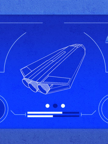
The Ship and its Cockpit were concepted to be a Hub to track progress within courses as well as overall progress on the Siteimprove catalog. As our explorers advanced their learning paths their ship would improve and they could visually experience progress in an engaging and fun way.
Course Look - Planets
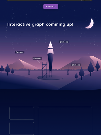
After learning the basics, learners are traveling through the Universe, and as they seek the knowledge they want , they are able to discover different planets and wonderful views. We prospected the possibility to make learning an appealing adventure , something that is exciting beyond the knowledge itself. In this examples we showcase different Planet concepts and how they may be integrated into an appealing and exciting UX and UI.

Logo

Video
Video was another way in which we wanted to elevate our brand, look and feel. Here are some examples of ideas that were developed.

Graphic Elements
We developed graphic elements that were used all across our courses. This elements both fit the Siteimprove aesthetic and Frontier Space Theme. Here are some examples.


